Brand Identity
Package Design
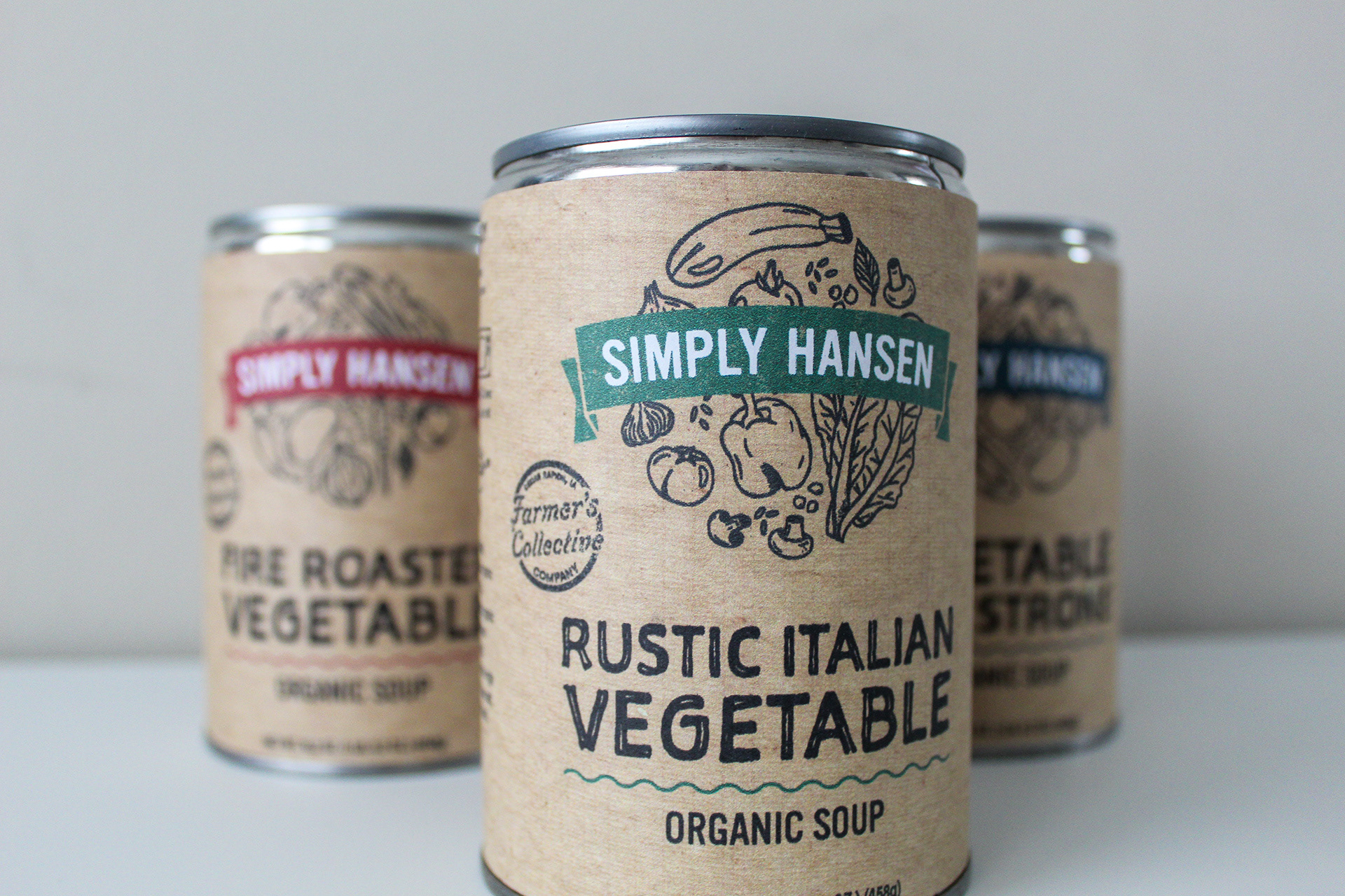
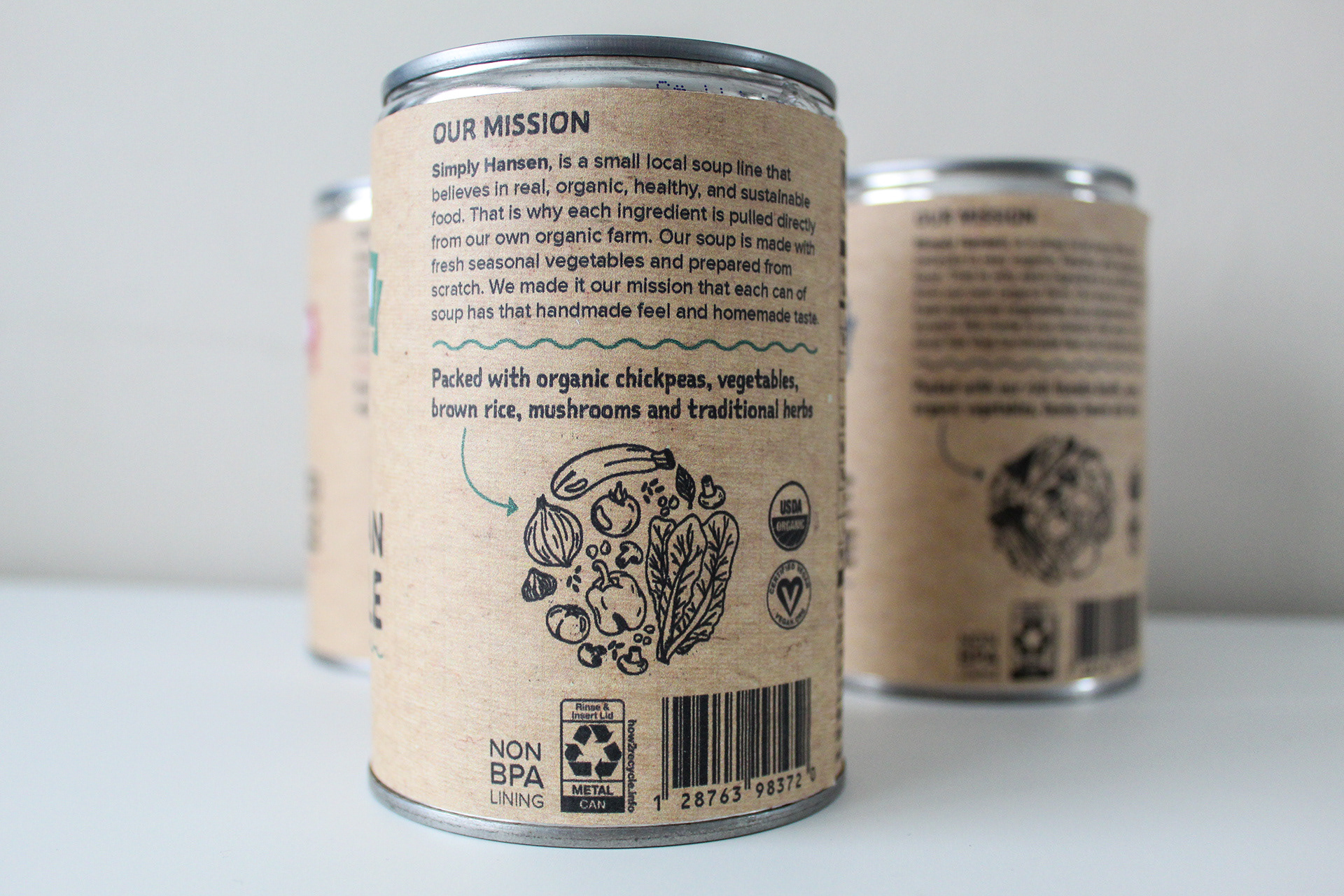
Simply Hansen is an emerging organic soup brand under the umbrella of Farmer’s Collective Co. Originating from a grassroots effort of selling jars of soup at local farmers' markets, Simply Hansen is deeply committed to the quality of their product and in using whole organic ingredients. When establishing the brand, it was essential to convey a homemade aesthetic through the design. The logo illustrations and recycled paper labels reinforce this ethos, highlighting the brand's authenticity. Each illustration is uniquely crafted to reflect the specific flavor of the soup, incorporating corresponding ingredients for a cohesive and appealing identity. Additionally, we developed a suite of supporting elements to strengthen their presence and create a comprehensive brand experience.


This is a conceptual design project