Editorial Design
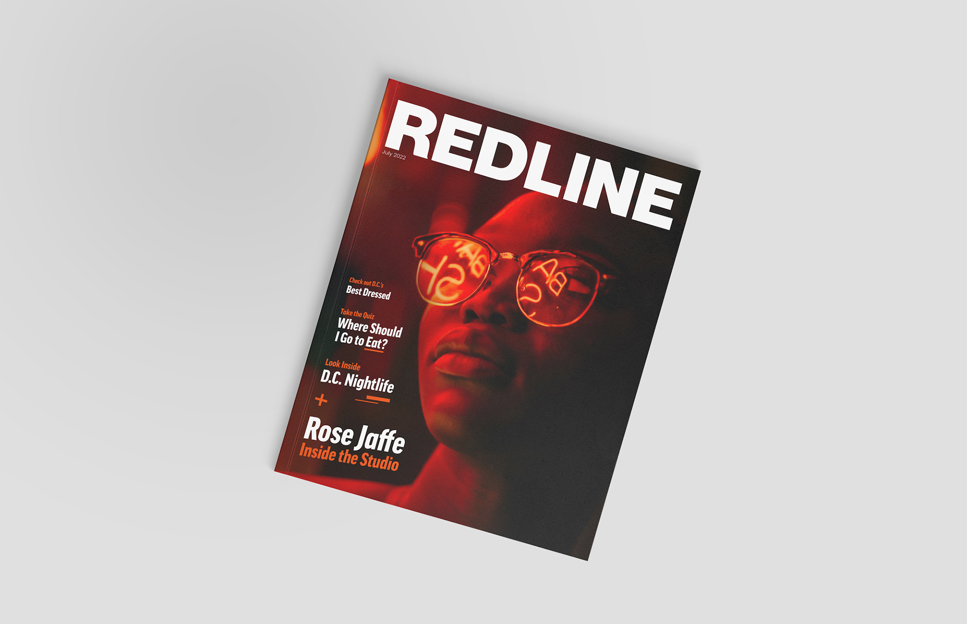
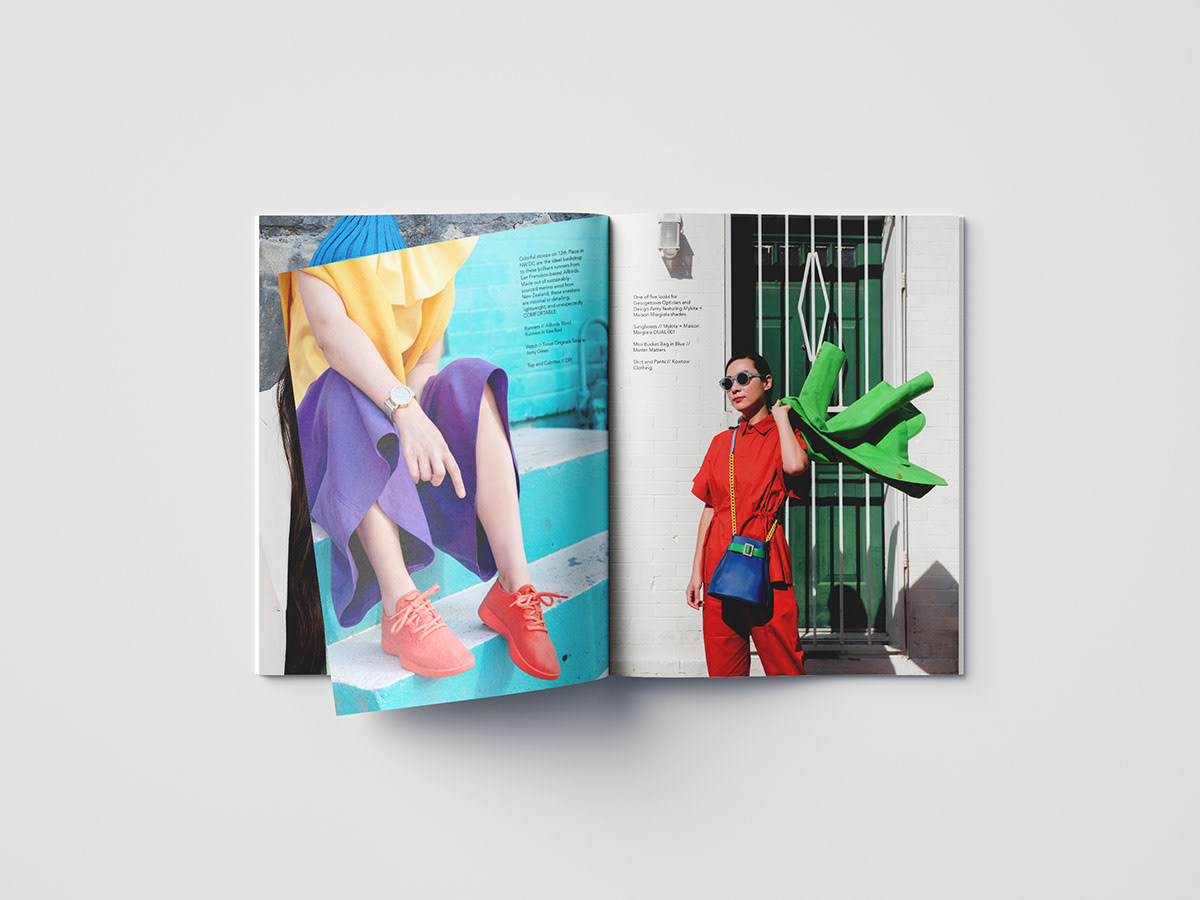
Redline is a regional magazine in the DC metro area, created to resonate with a younger, more locally engaged audience. The publication needed a visual identity that felt both fresh and credible. We developed a minimalist design system anchored by bold typography, vibrant color, and art-forward imagery. This balance of clean design and high energy created a youthful but professional aesthetic, helping Redline connect authentically with its readers. The new brand identity positioned the magazine as a must-read for local culture, conversation, and community.


This is a conceptual design project